Timing & You Relative Risk Index (RRI)™

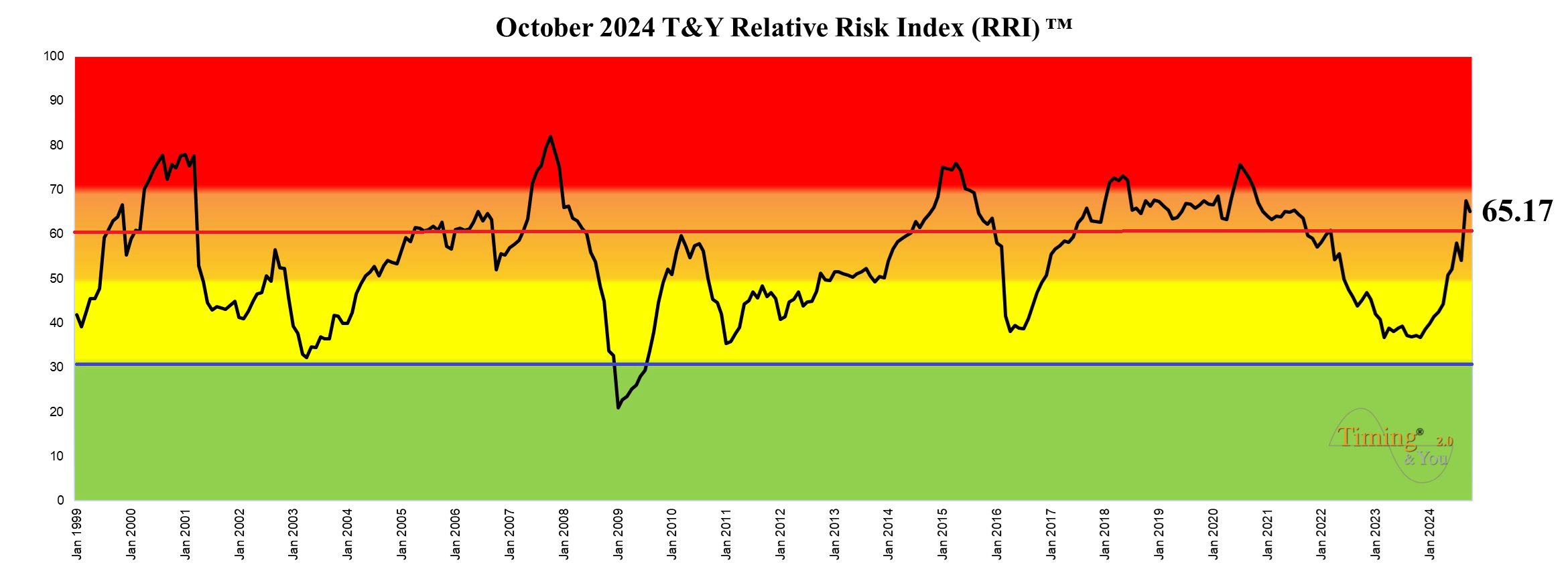
T&Y Relative Risk Index (RRI)™ is a proprietary 3-dimensional model which analyzes 14 different cyclical, technical, financial, credit, and economic indicators and composes of a correlation of 47 individual sub-models to tell at a glance whether the U.S. stock market environment is bullish, bearish, or somewhere in between. T&Y RRI™ is probably the first of its kind in the world that combines Cycle Analysis (40%), Technical Analysis (30%) and Fundamental Analysis (30%) parameters to give a holistic risk-reward assessment of the U.S. stock market on a monthly basis.
As the name suggests, T&Y RRI™ determines the risk level of the U.S. stock market by studying and comparing the previous cycle highs and lows to the current market. It is upper-bound at 100% (extreme high risk) and lower-bound at 0% (zero risk). This means that it cannot rise above 100% and it cannot fall below 0%. The higher the value, the greater the risk and the lower the value, the lower the risk level.
T&Y RRI™ divides the U.S. stock market risk into 4 main colour zones:
Green - "low risk" = between 0% - 30%, representing a relatively low risk and positive U.S. stock market environment. It is a good time to CONSIDER entering the market to do value investing or bottom-fishing.
Yellow - "low medium risk = between 30% - 50%, illustrating that the risk level has risen and is now above that of the green zone.
Orange - "high medium risk" = between 50% - 70%, illustrating that the risk level has risen substantially and is closing in to the dangerous red zone.
Red - "high risk" = between 70% - 100%, representing a high-risk and negative U.S. stock market environment. It is time to CONSIDER exiting the market, raise cash level or even perform short-selling. Not a good time to buy and hold.
A simple analogy: one cannot die from jumping out the 1st floor window, but one will die if he/she were to jump out from the 10th floor window. When the risk level is high (10th floor window = red zone) and one enter to buy stocks (jumping out the window), the result is tragic death. When the risk level is low (1st floor window = green zone) and one enters to buy stocks (jumping out the window), the result is an injury, but not death.
As we can see in the above T&Y RRI™ chart, historically for the last 23 years (1999 - 2022), it has had a good track record of assessing the risk-reward level and predicting pullbacks and surges in the U.S. stock market. It reached red “high risk” levels in the 2000 Nasdaq bubble and 2008 Global Financial Crisis (GFC). It broke into green “low risk” level before the U.S. stock market bottomed out in March 2009 and snapshot how the risk level has reduced during the 2011 European Crisis and 2016 before the big post-U.S. election rally. The model hit high risk level in 2018 before a significant correction. It remained in the red zone until early 2021, illustrating that the risk level was high as the U.S. stock market rallied from a Covid-19 low. T&Y RRI™ has since declined into the orange and yellow zone, indicating that the risk level has subsided with the arrival of the long-awaited bear market.
Dynamic Cycle Charts

One of the most valuable resources of Timing & You is our proprietary dynamic cycle charts. This is where you will find our latest Artificial Intelligence (AI) and Neural Net forecasts that indicate upcoming TURNING POINTS in different investment asset classes such as U.S. stock market, US$, commodities such as oil, gold, silver, U.S. 10-year Treasury and Bitcoin.
Each cycle chart is comprised of projections of all known trading cycles impacting the underlying asset. Therefore, the more the data history, the better. One very important point to take note: cycle charts are about TIMING and TURNING POINTS, they ARE NOT BUY OR SELL SIGNALS, so we should not just go out and buy or sell on any particular date. We should only focus on the major turning points on the cycle charts, not the cycle magnitude and please take note that the cycle charts do not relate to price. Do not expect Cycle Analysis to pinpoint highs or lows in price actions. Instead, Cycle Analysis should be used in conjunction with other aspects of Technical Analysis (TA) or Fundamental Analysis (FA) to anticipate turning points. From the above dynamic cycle chart of Dow Jones crunched on 8th January 2020, we can forecast a POSSIBLE turning point around the middle of January 2020, which will then be followed by the next turning point towards the end of March 2020. This accurately captured the deep correction of the Covid-19 pandemic way BEFORE the waterfall happened. Please also take note that Cycle Analysis is NOT exact science and all forecasts have built-in inherent limitations, so the turning points can be off by a few days or weeks for the purpose of performing forecast from the cycle charts. Based on our experience and back-testing, cycle charts are accurate to the date better than 70% of the time. However, do take note that that cycle inversion is to be expected OCCASIONALLY when cycle high occurs when there should be a cycle low and vice versa due to the influence of larger macro-economic cycles, or sometimes government manipulation of a market or when a cycle high or low is skipped or minimal. A cycle low may be short or almost non-existent in a strong uptrend. Similarly, markets can fall fast and skip a cycle high during sharp declines. Cycle inversions are more prominent with shorter cycles and less common with longer cycles. For instance, one could expect more inversions with a short-term 10 week cycle than an intermediate-term 40 weeks cycle or 7 year long-term cycle.
![[Nov2022]_T_Y 2.0 – Black Transparent@2x](https://timingandyou.com/core/wp-content/uploads/2022/12/Nov2022_T_Y-2.0-Black-Transparent@2x.png)